


Creating a compelling color story is crucial in fashion design, as it can convey a narrative, evoke emotions, and unify a collection. This article outlines key steps to develop a cohesive color story for your fashion line.
1. What is a Color Story?
A color story is an essential element in fashion design, serving as a thematic arrangement of colors that communicates a cohesive narrative throughout a collection. It encompasses the colors chosen for garments, accessories, and even the overall presentation of a brand or collection. A well-crafted color story not only establishes the visual identity of a collection but also plays a critical role in conveying emotions and themes, influencing how consumers perceive and engage with the designs. Here’s a detailed exploration of what a color story entails and its significance in fashion.
Defining a Color Story
At its core, a color story is about selecting and harmonizing colors to create a specific mood or theme. It involves understanding how different colors interact with one another and how they can evoke various emotions or responses. Color stories are often tied to the overarching concept or theme of a collection, allowing designers to tell a compelling visual narrative through their work.

Components of a Color Story
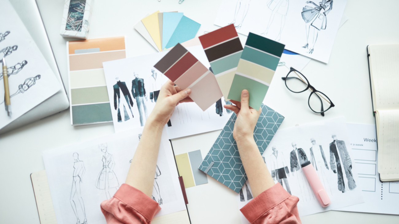
1. Color Palette: A color story begins with the selection of a color palette, which consists of primary, secondary, and accent colors. Designers often choose a few key colors that will dominate the collection, supplemented by complementary shades to add depth and interest.
- Primary Colors: These are the main colors that define the collection, forming the foundation of the color story. They set the tone and mood.
- Secondary Colors: These colors provide balance and contrast to the primary colors, enhancing the overall composition.
- Accent Colors: Used sparingly, accent colors can draw attention to specific details, creating focal points in the designs.
2. Color Harmonies: Designers often consider color harmonies, such as complementary, analogous, and triadic color schemes, to create visually appealing combinations. These harmonies help in establishing a sense of unity and flow within the collection.
3. Emotion and Meaning: Different colors evoke various emotional responses and carry cultural meanings. For example, red can symbolize passion and energy, while blue may convey calmness and trust. Designers should consider the emotions they want to evoke in their audience when selecting colors for their story.
4. Seasonal Relevance: Color stories are often influenced by seasonal trends, with specific colors becoming more popular during certain times of the year. For instance, pastel colors may dominate spring collections, while deep jewel tones might be more common in fall. Aligning the color story with seasonal expectations can enhance its appeal.
The Role of Color Stories in Fashion Collections
- Establishing Identity: A cohesive color story helps define a brand’s identity and aesthetic. Iconic fashion houses are often recognized by their signature color palettes, which convey their unique style and values. For example, the use of bold colors and patterns by brands like Versace or the minimalist palettes of brands like Calvin Klein create strong visual identities that resonate with consumers.
- Creating Cohesion: Within a collection, a well-executed color story ensures that all pieces feel interconnected. This cohesion is vital for presenting a unified vision on the runway or in lookbooks, helping audiences understand the designer’s intent and theme.

- Enhancing Visual Appeal: A compelling color story draws attention and creates visual interest, making the collection more memorable. When colors are thoughtfully arranged, they can captivate audiences and enhance the overall presentation of the designs.
- Emotional Connection: Colors have the power to evoke emotions and create a sense of connection with the audience. A color story that resonates emotionally can influence consumer perceptions and purchasing decisions. For instance, warm, vibrant colors may evoke feelings of joy and excitement, while softer, muted tones can create a sense of calm and tranquility.
Examples of Effective Color Stories
Throughout fashion history, many iconic collections have showcased effective color stories that resonate with audiences:
- Chanel’s Classic Black and White: Chanel’s use of black and white creates a timeless and elegant color story that embodies sophistication and simplicity. This color combination has become synonymous with the brand’s identity.
- Prada’s Bold Colors: Prada often embraces unconventional color combinations and bold hues, creating striking visual narratives that challenge traditional notions of beauty. Their use of unexpected color pairings can evoke intrigue and curiosity.

- Balenciaga’s Monochromatic Looks: Balenciaga has successfully employed monochromatic color stories in its collections, focusing on varying shades of a single color to create depth and interest. This minimalist approach allows the design and silhouette to take center stage.
- Spring/Summer Collections: Many designers draw inspiration from nature for their seasonal collections, creating color stories that reflect the vibrant hues of blooming flowers or the muted tones of sandy beaches. For example, soft pastels may dominate spring collections, while rich earth tones might be featured in fall collections.
Creating Your Own Color Story
For designers looking to develop their own color stories, consider the following steps:
- Research and Inspiration: Gather inspiration from various sources, such as nature, art, culture, or current trends. Look for color palettes that resonate with the theme of your collection.
- Experimentation: Use color swatches or digital design tools to experiment with different color combinations. Create mood boards to visualize how the colors interact and support the collection’s narrative.
- Focus on Emotion: Consider the emotions you want to evoke in your audience. Choose colors that align with these feelings and reinforce the message of your collection.
- Iterate and Refine: Be open to revisiting and refining your color story as you develop your designs. Sometimes, new ideas or inspirations can lead to a more effective color palette.
2. The Psychology of Color
The Psychology of Color in Fashion Design
Colors have a profound impact on human psychology, influencing emotions, perceptions, and even behaviors. In fashion design, understanding the psychology of color is essential for creating collections that resonate with consumers. Each color carries specific meanings and associations, and these can vary across cultures, making it crucial for designers to consider their audience when selecting a color palette. Below is an exploration of how different colors affect consumer perceptions and how designers can leverage these insights in their work.
1. Red: Passion and Energy
Red is one of the most powerful colors in the spectrum, often associated with strong emotions and intense feelings.

- Emotional Impact: Red evokes feelings of passion, energy, and excitement. It is commonly linked to love and desire, making it a popular choice for romantic occasions.
- Consumer Perception: In retail settings, red can stimulate appetite and encourage impulsive buying, which is why it is frequently used in marketing and promotional materials. Brands often employ red to grab attention and create a sense of urgency.
- Fashion Implications: Designers may use red in collections aimed at conveying boldness and confidence, appealing to consumers looking to make a statement.
2. Blue: Calmness and Trust
Blue is often viewed as a calming and reassuring color, associated with tranquility and reliability.

- Emotional Impact: Blue represents calmness, stability, and trustworthiness. It is frequently used in corporate branding and is known to evoke feelings of peace and serenity.
- Consumer Perception: Many consumers perceive blue as a safe and secure choice, making it a popular color for brands in sectors like finance, healthcare, and technology.
- Fashion Implications: In fashion, blue can convey professionalism and confidence. Designers often use various shades of blue to create sophisticated and timeless collections, appealing to consumers seeking dependable and versatile pieces.
3. Green: Growth and Harmony
Green is a color deeply rooted in nature, symbolizing growth, renewal, and balance.

- Emotional Impact: Green is associated with harmony, freshness, and fertility. It evokes a sense of well-being and is often linked to environmental consciousness.
- Consumer Perception: In recent years, green has gained popularity as consumers become more environmentally aware. Brands that use green in their designs can communicate a commitment to sustainability and ethical practices.
- Fashion Implications: Designers may incorporate green into collections to evoke feelings of peace and health. This color can appeal to consumers who value eco-friendly and sustainable fashion.
4. Yellow: Joy and Optimism
Yellow is often associated with sunshine, happiness, and cheerfulness.

Emotional Impact: Yellow conveys feelings of joy, optimism, and warmth. It can stimulate feelings of happiness and positivity, making it an uplifting color choice.
Consumer Perception: Bright yellow can capture attention and create a sense of excitement. However, excessive use can lead to feelings of anxiety, so designers must use it judiciously.
Fashion Implications: Designers often use yellow in spring and summer collections to evoke a sense of freshness and vitality. It can attract consumers looking for cheerful and vibrant pieces.
Cultural Variations in Color Meanings
Understanding that color meanings can vary significantly across different cultures is crucial for designers.

- Cultural Context: For example, while white is often associated with purity and weddings in Western cultures, it may represent mourning and death in some Eastern cultures. Similarly, red can signify good fortune and celebration in Chinese culture, while it may have different connotations in other contexts.
- Tailoring Collections: Designers must consider cultural variations when creating collections for diverse audiences. This involves researching and understanding the cultural significance of colors to ensure that their designs resonate positively with consumers in various markets.
Influencing Consumer Behavior
Colors can influence consumer behavior in multiple ways, encouraging both impulsive and thoughtful purchases.
- Impulsive Purchases: Colors like red and yellow can stimulate excitement and urgency, leading to impulsive buying decisions. Retailers often use these colors in sales promotions and clearance events to entice shoppers.
- Thoughtful Purchases: Colors that evoke calmness and trust, such as blue and green, can encourage consumers to make thoughtful and deliberate purchases. These colors are often used in branding for products that consumers perceive as essential or long-term investments.

3. Finding Inspiration for Your Color Palette
Finding Inspiration for Your Color Palette
Creating a compelling color palette is essential for any fashion collection, as it establishes the mood, theme, and identity of the designs. Inspiration for color palettes can be drawn from various sources, each offering unique insights and perspectives. Here’s an exploration of different avenues to find inspiration for your color palette, along with the importance of mood boards in the process.
1. Nature: Observing Seasonal Changes and Landscapes
Nature is one of the most abundant sources of inspiration for color palettes. The changing seasons provide a wealth of colors that can evoke specific feelings and themes.
- Seasonal Changes: Each season presents its own distinct color palette. For example, spring is often characterized by soft pastels, bright florals, and fresh greens, while autumn brings rich, warm hues like burnt orange, deep reds, and earthy browns. Observing these shifts can help you create collections that reflect the beauty of each season.

- Landscapes: Various natural landscapes, such as forests, deserts, mountains, and oceans, can inspire unique color combinations. The colors found in sunsets, wildflowers, or even a snowy landscape can provide a rich foundation for a color palette that resonates with the emotions associated with those environments.
2. Art: Draw from Paintings or Sculptures
Art has long been a powerful influence in fashion, and it can serve as a rich source of inspiration for color palettes.
- Paintings: Analyzing the works of famous painters can reveal effective color combinations and harmonies. For example, the vibrant colors used by Impressionist painters like Claude Monet can inspire soft, romantic palettes, while the bold and contrasting hues of a Van Gogh painting might evoke energy and excitement.
- Sculptures and Mixed Media: The textures and materials used in sculptures can also inspire color choices. An artist’s use of patina or metallic finishes might lead to innovative color ideas that incorporate sheen or depth, pushing the boundaries of traditional palettes.
3. Architecture: Urban Environments
Architecture can offer unique color combinations and insights that can enhance your color palette.
- Urban Environments: Cityscapes, historical buildings, and modern architecture can provide a diverse array of colors. The interplay of materials like brick, glass, metal, and concrete, along with the impact of light and shadow, can inspire unexpected color pairings.
- Cultural Influences: Different architectural styles from around the world often feature specific color schemes. For example, Mediterranean architecture tends to use warm, earthy tones, while Scandinavian design often incorporates soft pastels and neutrals. Studying these influences can help you develop a unique color story for your collection.
4. Cultural Events: Festivals and Traditions
Cultural events and traditions are vibrant sources of inspiration that can bring a lively spirit to your color palette.

- Festivals: Celebrations like Holi in India, which is known for its explosion of colors, or the colorful attire worn during Carnival in Brazil can inspire palettes filled with bright, bold hues. These events often reflect cultural heritage and can inform collections that celebrate diversity and inclusivity.
- Traditional Garments: Exploring the colors used in traditional costumes around the world can provide insights into cultural significance and symbolism. Understanding the meanings behind certain colors in different cultures can help you create collections that resonate on a deeper level with diverse audiences.
5. Trend Forecasting Services
Staying ahead of industry trends is crucial for a successful fashion collection, and trend forecasting services can offer invaluable insights.

- Pantone:Known for its color matching system, Pantone releases annual color forecasts that highlight trending colors for various industries, including fashion. By studying Pantone’s reports, designers can anticipate consumer preferences and incorporate these colors into their collections.
- WGSN: As a leading trend forecasting platform, WGSN provides in-depth analysis of upcoming trends, including color palettes that reflect cultural shifts, consumer behavior, and market dynamics. Utilizing insights from WGSN can help ensure your collection remains relevant and appealing.
6. Creating Mood Boards
Once you’ve gathered inspiration from these diverse sources, creating a mood board can help visualize your ideas and bring your color palette to life.
- Visual Representation: A mood board allows you to compile images, color swatches, textures, and materials that represent your envisioned collection. By organizing these elements, you can see how they interact and support your overall theme.
- Dynamic Collection: Mood boards serve as a dynamic collection of imagery that can evolve as your ideas develop. You can experiment with different combinations and arrangements, allowing for flexibility and creativity in your design process.
- Communication Tool: Mood boards can also be an effective communication tool when collaborating with team members or presenting concepts to stakeholders. They provide a clear visual reference that conveys the intended mood and aesthetic direction of your collection.
4. Understanding Color Theory
Color theory is a fundamental aspect of design that enables fashion designers to create visually appealing and cohesive collections. A solid understanding of color theory helps in developing balanced palettes that effectively convey emotions and themes. This guide explores the key components of color theory, including primary, secondary, and tertiary colors, various color relationships, and the effects of warm and cool colors.

Primary, Secondary, and Tertiary Colors
At the heart of color theory are the three categories of colors: primary, secondary, and tertiary. Each plays a crucial role in the development of a color palette.
- Primary Colors: The primary colors—red, blue, and yellow—are the foundation of all other colors. They cannot be created by mixing other colors together. These colors are essential because they serve as the building blocks for creating a diverse range of hues.
- Secondary Colors: Secondary colors are formed by mixing two primary colors. The combinations yield green (blue + yellow), orange (red + yellow), and purple (red + blue). These colors expand the palette and introduce new possibilities for combinations.
- Tertiary Colors: Tertiary colors are created by mixing a primary color with a secondary color, resulting in hues such as red-orange, yellow-green, blue-green, and more. These colors add depth and complexity to color palettes, offering designers a wider range of options for their collections.
Color Relationships
Understanding color relationships is crucial for creating harmony and contrast within a color palette. There are several key types of color relationships.

- Monochromatic: This relationship consists of variations of a single color, including different shades, tints, and tones. Monochromatic palettes create a harmonious look by using variations in lightness and saturation. This approach is effective for conveying a specific mood or theme, allowing for subtlety and sophistication.
- Analogous: Analogous colors are located next to each other on the color wheel. For example, blue, blue-green, and green are analogous colors. This relationship offers a harmonious and cohesive look while providing slight variations that can add interest. Analogous palettes work well for collections that aim to evoke a specific emotional response or represent a natural theme.
- Complementary: Complementary colors are located directly opposite each other on the color wheel, such as red and green or blue and orange. This relationship creates a striking contrast that can be visually dynamic and impactful. Using complementary colors can draw attention to specific design elements, making them ideal for bold and eye-catching collections.
- Triadic: A triadic color scheme consists of three colors that are evenly spaced around the color wheel, such as red, yellow, and blue. This relationship provides a vibrant and balanced palette, combining the qualities of primary and secondary colors. Triadic schemes can create a sense of energy and excitement in a collection, making them suitable for youthful or playful designs.

Warm and Cool Colors
Recognizing the impact of warm and cool colors is essential for creating desired contrasts or harmonious effects in a fashion collection.
- Warm Colors: Warm colors, which include reds, oranges, and yellows, are often associated with energy, passion, and warmth. These colors tend to evoke feelings of excitement and enthusiasm, making them effective for drawing attention and creating a vibrant atmosphere. In fashion, warm colors can energize a collection and create a sense of movement.
- Cool Colors: Cool colors encompass blues, greens, and purples, evoking feelings of calmness, tranquility, and relaxation. These colors are often associated with nature and serenity, making them suitable for designs intended to convey a sense of peace or elegance. Cool colors can provide a soothing effect and work well in collections focused on understated sophistication.
- Creating Contrast: By understanding the relationship between warm and cool colors, designers can create striking contrasts that add visual interest and depth to their collections. For instance, pairing warm colors with cool tones can highlight specific elements and create a sense of balance within the overall design.
5. Building a Cohesive Color Palette

Building a Cohesive Color Palette
Developing a cohesive color palette is a crucial step in the fashion design process. A well-defined color palette not only enhances the aesthetic appeal of a collection but also helps convey the desired mood and message. Here’s a comprehensive guide on how to effectively build a cohesive color palette, focusing on the differentiation between core and accent colors, the incorporation of neutral tones, the importance of limiting the number of colors, and testing swatches on various fabrics.
1. Differentiate Between Core Colors and Accent Colors
When creating a color palette, it’s essential to understand the roles of core colors and accent colors:
- Core Colors: Core colors form the foundation of your palette and represent the primary hues that will dominate the collection. These are the main colors you will use in your designs and should reflect the overall theme and mood you want to convey. Core colors should be chosen with care, as they will set the tone for your entire collection.

- Accent Colors: Accent colors are used sparingly to highlight certain elements within your designs. These colors should complement the core colors and provide contrast, drawing attention to specific details, patterns, or embellishments. Accents can bring energy and dynamism to your collection, making the core colors feel more vibrant and alive.In a collection featuring navy blue and cream as core colors, a bright coral could serve as an accent color, adding visual interest and liveliness to the designs.
Incorporate Neutral Tones
Neutral tones are essential for balancing bolder colors within your palette. These colors provide a foundation that can enhance and support the overall design without overpowering it.
- Types of Neutral Tones: Common neutral tones include black, white, beige, gray, and taupe. These colors can be used effectively as backgrounds or base layers in your designs, allowing core and accent colors to shine.
- Balancing Bold Colors: Using neutral tones helps to create harmony in your palette by softening the impact of vibrant colors. For instance, if your collection features bright yellows and reds, incorporating black or gray can help ground the designs and create a more cohesive look.
- Versatility: Neutrals offer versatility and can easily be paired with various colors, making them a staple in fashion collections. They can also help to create a timeless quality, ensuring that your designs remain relevant across seasons.
Limit the Number of Colors

A key principle in color palette development is to limit the number of colors you use in your collection. Too many colors can lead to overwhelming and chaotic designs, detracting from the overall impact.
- Recommended Number: A good rule of thumb is to choose a maximum of three to five core colors, complemented by one or two accent colors. This limitation allows for a more focused and harmonious collection.
- Cohesion and Clarity: By restricting the color palette, you create a clearer visual message and a more cohesive collection. A limited palette can also make it easier for consumers to mix and match pieces, enhancing the wearability of your designs.
- Focus on Key Colors: When selecting colors, prioritize those that align with your collection’s theme and target audience. This focus ensures that your designs resonate with consumers and communicate the intended message effectively.
Test Swatches on Various Fabrics
Once you have established your color palette, it’s essential to test your color choices on various fabrics to assess how they interact with different textures.
- Fabric Interaction: Colors can appear differently depending on the material. For instance, a vibrant hue may look muted on a textured fabric, while the same color may appear more vivid on a smooth surface. Testing swatches allows you to see how colors behave and adjust your palette accordingly.
- Creating Sample Swatches: Create small swatches of each color and apply them to different fabric types, such as cotton, silk, wool, or synthetic materials. Observe how the colors change in terms of saturation and brightness under different lighting conditions.
- Adjusting the Palette: Based on the outcomes of your tests, you may need to adjust your color choices. If a color does not translate well to a specific fabric, consider modifying the hue or selecting a different color that achieves the desired effect.
Continue Reading:
How to Create Color Stories for Your Fashion Collection / Part 1
How to Create Color Stories for Your Fashion Collection / Part 2
How to Create Color Stories for Your Fashion Collection / Part 3
Written by Kseniya Kasachova
Add a Comment